


The key to creating a great visualisation is understanding the job to be done. For example, are you enabling somebody to explore information (an option that facilitates many routes), or are you using it to explain your findings (an option that supports the telling of a single story)? In this post I introduce MEME, a framework to enable you to be clear about the role for your visualisation project, a key step in creating great visualisations.
The MEME framework identifies four different roles for visualisations:
M -> Monitor
E -> Explore
M -> Manage
E -> Explain
Monitoring is when the user wants to be informed about pre-defined packages of information. A dashboard is a typical way of enabling monitoring. If we think about a fitness app, perhaps Strava, we can see four aspects of Monitoring: active versus reactive and status versus trend:
• Active monitoring – things I want to see all the time, which might include my pace, my route, and my effort level.
• Reactive monitoring – things I want to be alerted to if they happen, but otherwise I don’t want to see them. For example, I might want an alert that my heart rate is too high, but I don’t want a message flashing green to say ‘heart OK’.
Both active and reactive can comprise two elements: status and trend:
• Status monitoring – showing the current values, such as current speed, current location, and current time.
• Trend monitoring – shows patterns over time. For example, after the run or cycle, I might want to see how my stats fit into the bigger picture; was today faster, how did my pace change during the run, and how far have I run this week, month and year?
Explore enables the user to find their answers, from a wider range of options. In monitor, we tend to know the use to which the user is going to put the information. In explore, we don't necessarily know the user’s purpose, so we need to enable a wide range of options. For some uses, a dashboard can be an appropriate way of using visualisation to enable exploring data, but there are other options that are sometimes more relevant to users’ needs.
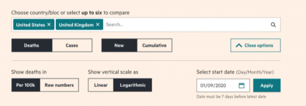
In terms of dashboards for exploring data, a great example is the Financial Times Covid visualisation site. The website has a set of pre-built and populated options that allow the user to choose how to explore the patterns and stories in the data. For example, the ‘How your country compares’ section allows the user to configure a trend chart showing different elements. In the image below, the user is choosing two countries (UK and USA) to show new deaths, per 100K of population, using a logarithmic scale, for data from the 1st of September 2020.
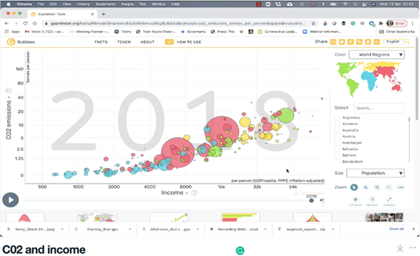
One of the most famous presenters of complex data was Hans Rosling (discussed in an earlier post), who created a non-dashboard, data interrogation tool called Gapminder. The image below shows an example created in Gapminder. If you click on the image, you will see a video using the Gapminder data and interrogation tool to explore the link between CO2 and wealth.
Manage takes visualisation away from the communication of information and into the creation of action. For example, think about driving and using a satnav. As you approach a complex motorway junction, your satnav may show you a video of the junction with arrows on it indicating where you are and where you should be heading, and this may be supplemented with voice instructions. In this case, the visualisation is managing the process, it is telling the user what they should do, as opposed to supplying information to enable the user to decide what to do. As with all visualisations, the key is to balance the information with clarity – the view of the junction will ideally be stylised, to help you envision the map to territory relationship quickly.
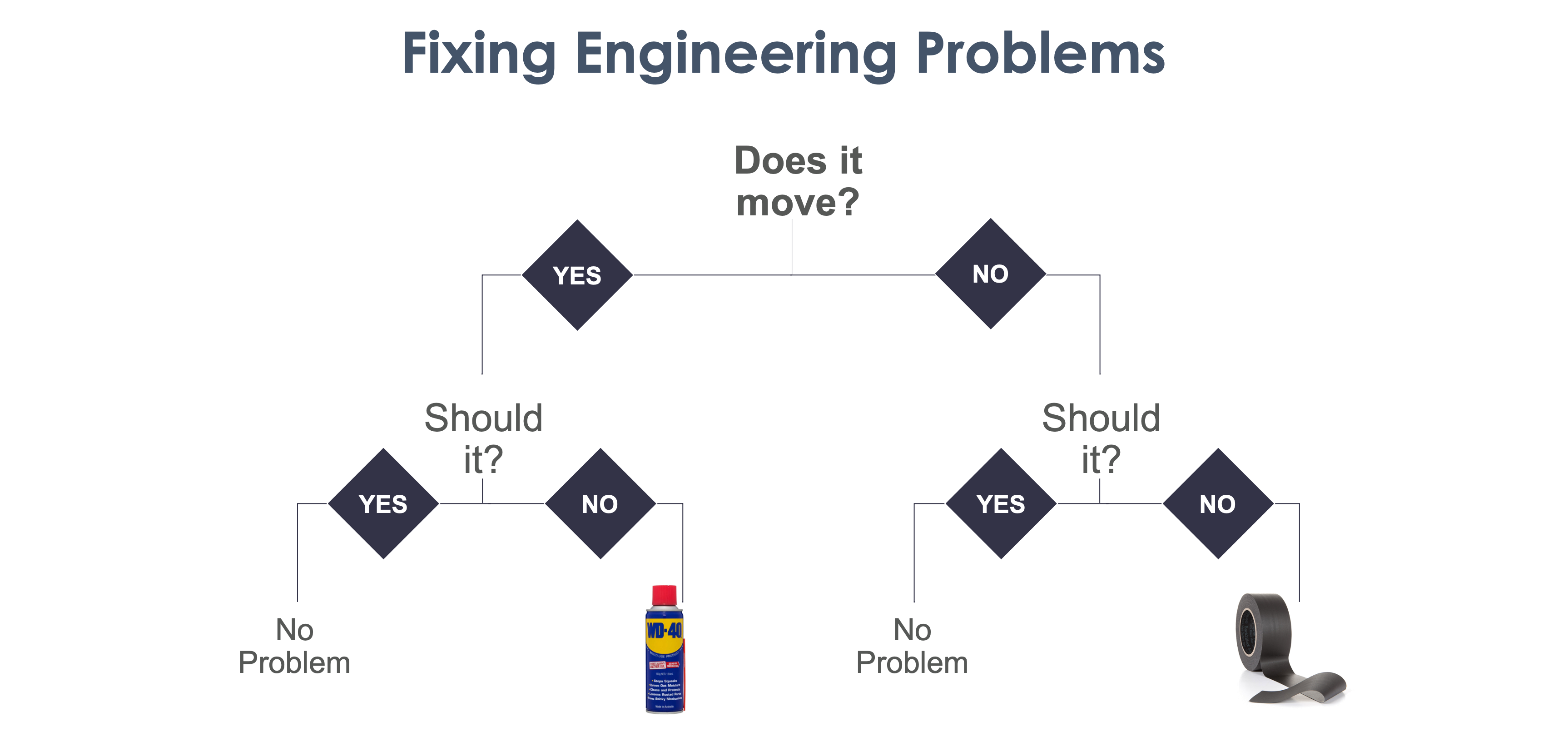
The famous, humorous WD-40 v Duct Tape flow chart is an example of a Manage visualisation.
Explain is the process of conveying a message to an audience, it is storytelling. When we use visualisation to explain information, there is an end point that we have determined and which we wish to create. For example, we might want the CMO to shift their ad spend from radio to social media. The visualisation helps show why this recommendation is a good idea. This type of visualisation is not intended to empower the audience, it is intended to persuade the audience.
Earlier in this post, I mentioned Hans Rosling and his data interrogation tool Gapminder. In a video he produced for the UK’s BBC, he uses Gapminder to communicate a specific message. The video shows the story of the link between health and wealth, and shows what is possible, in just four minutes. However, the difference between explore and explain is that he is not showing all of the alternative routes, the blind alleys, the less clear cases etc. He is telling the story in a way that leads inexorably from his starting position to his diagnosis and prescription.


